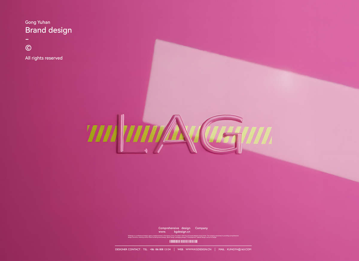
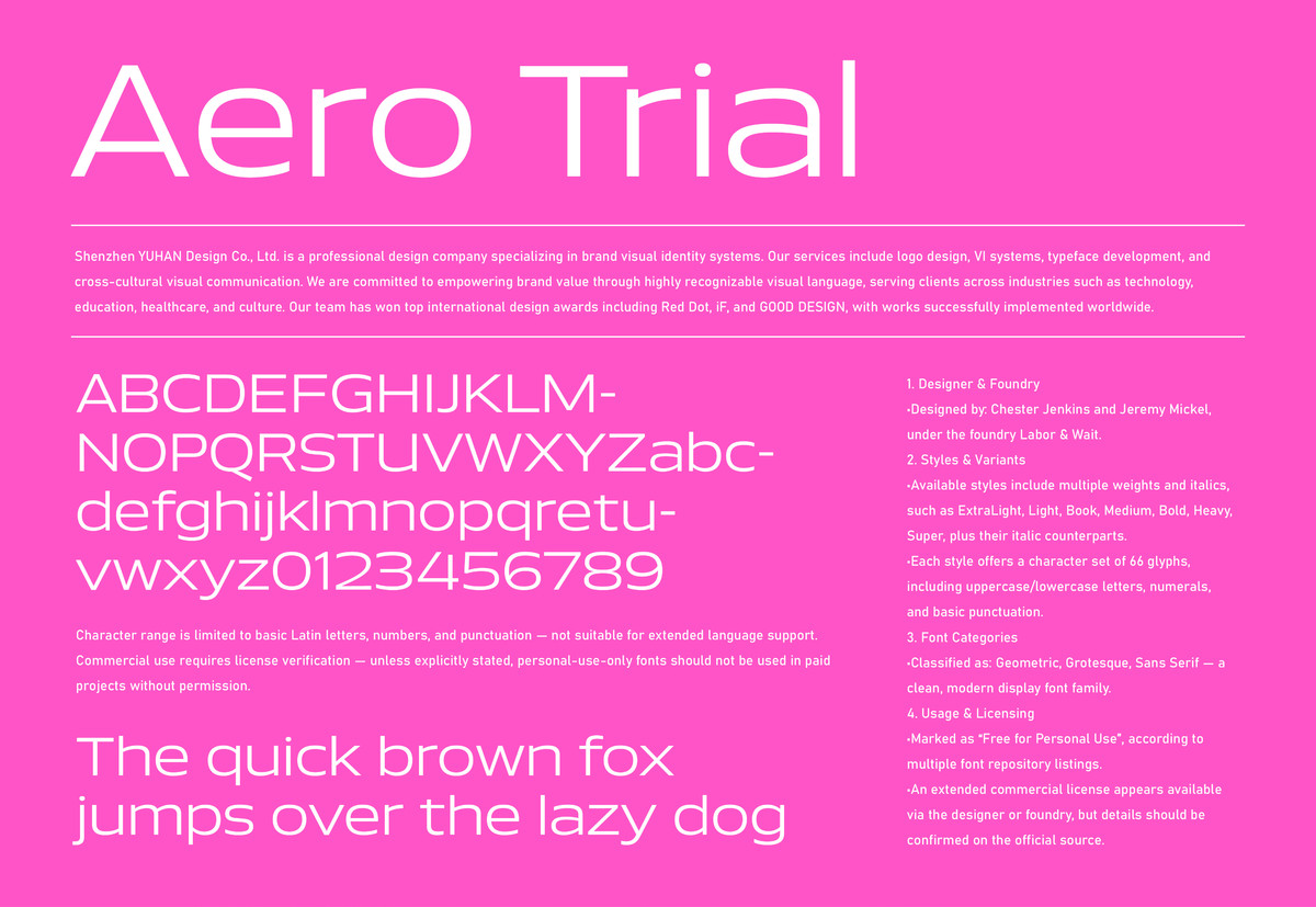
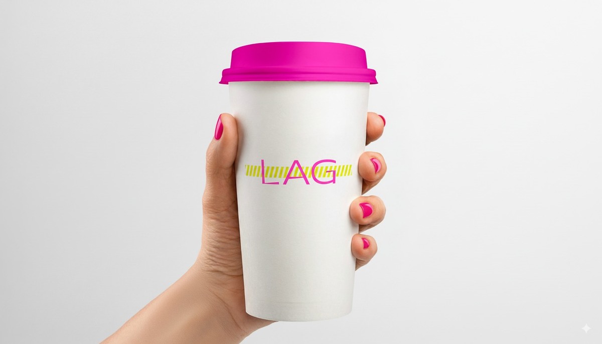
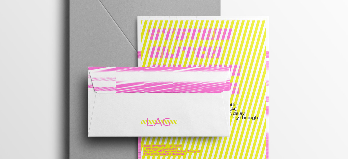
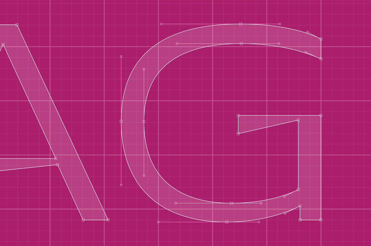
【我司案例】LAG

· 成功案例

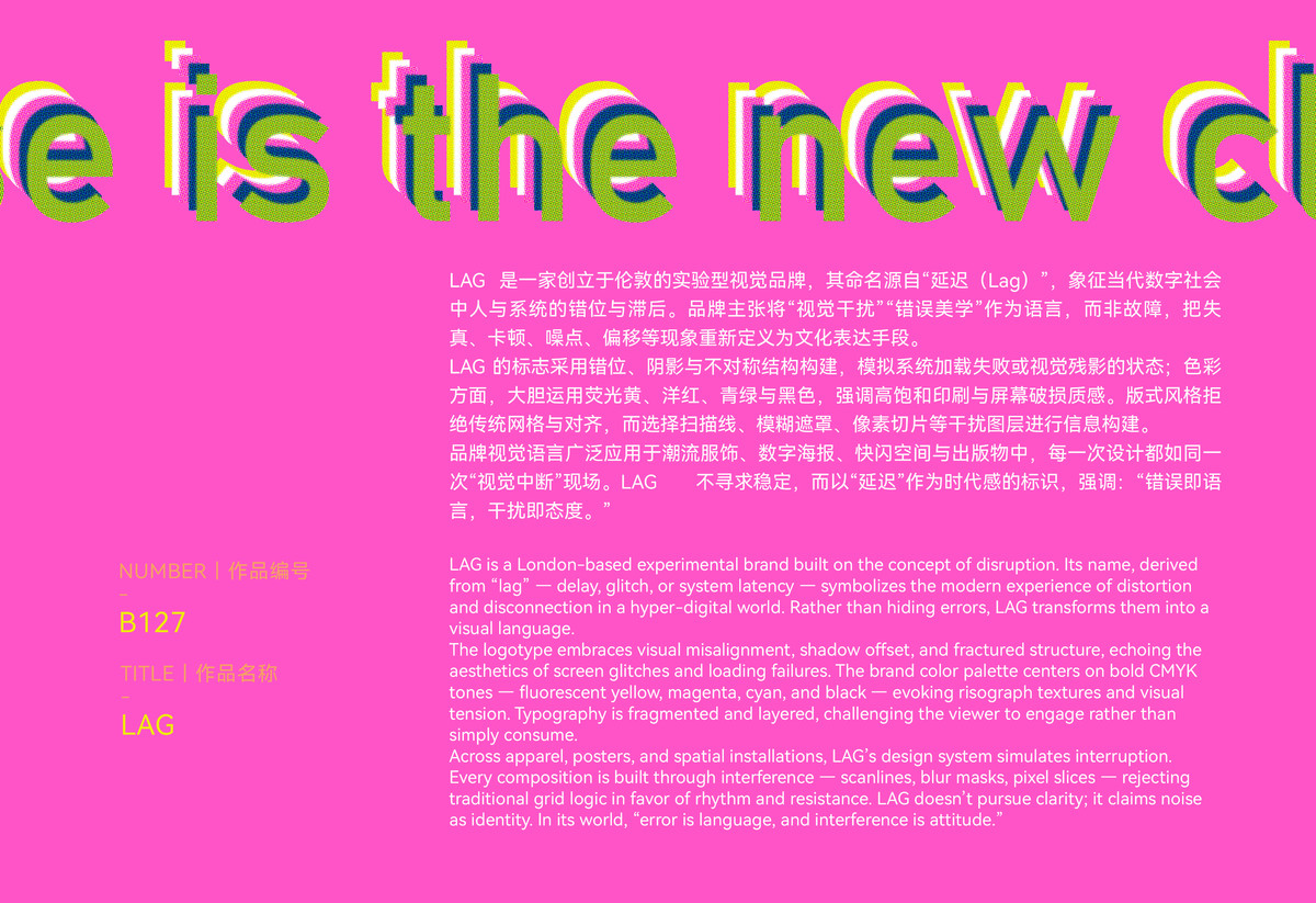
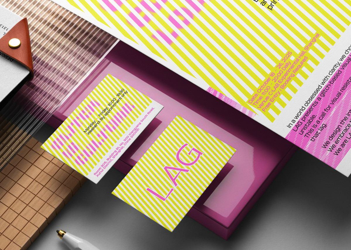
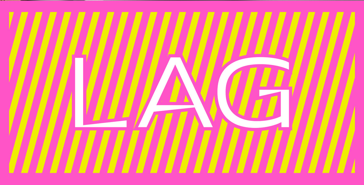
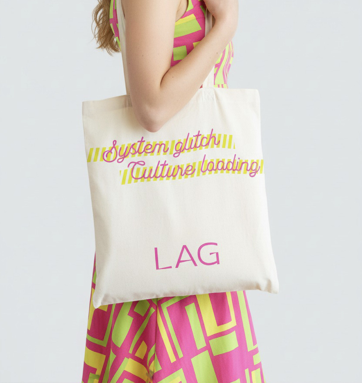
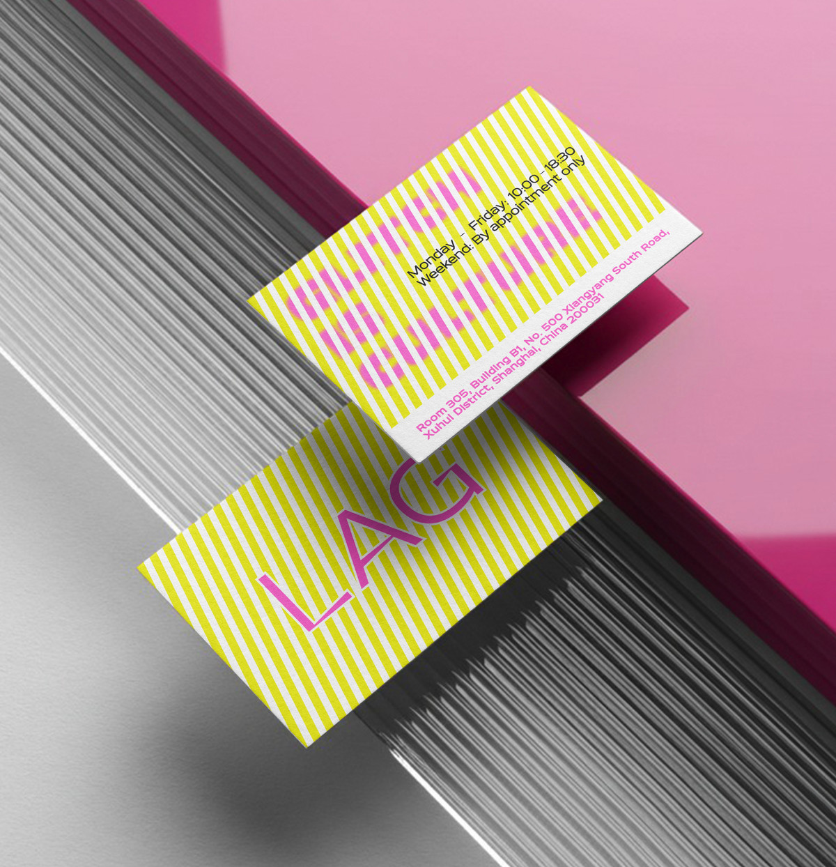
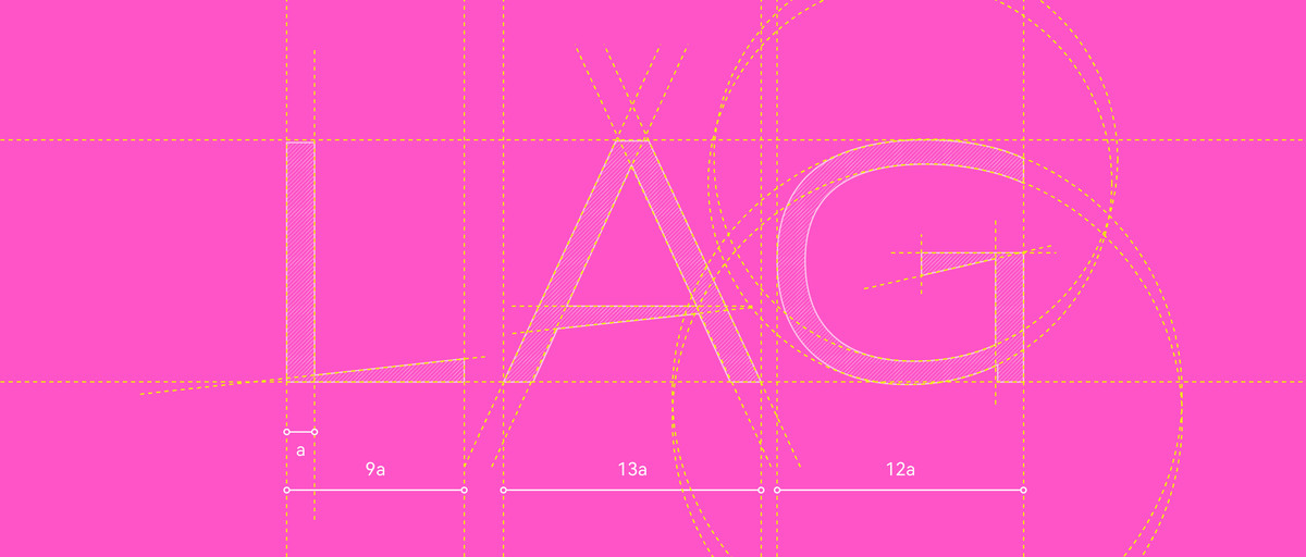
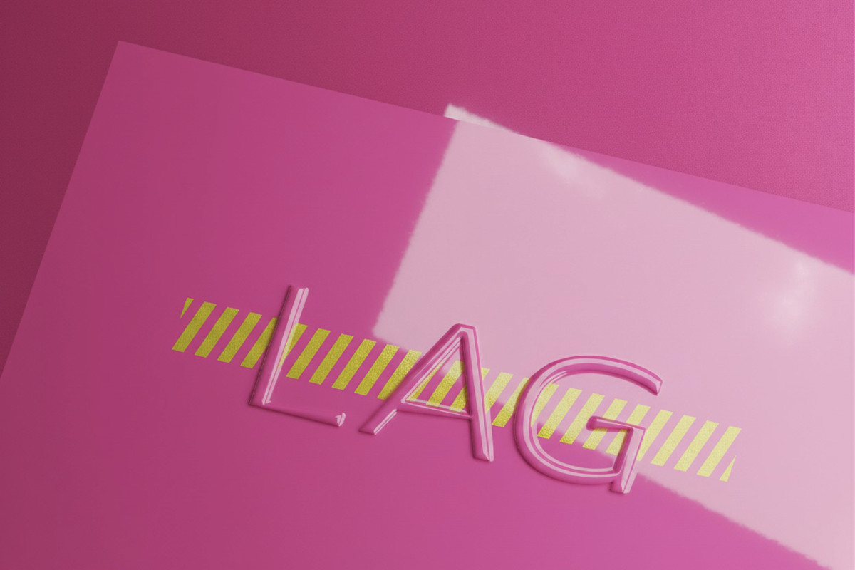
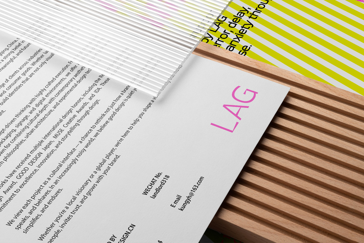
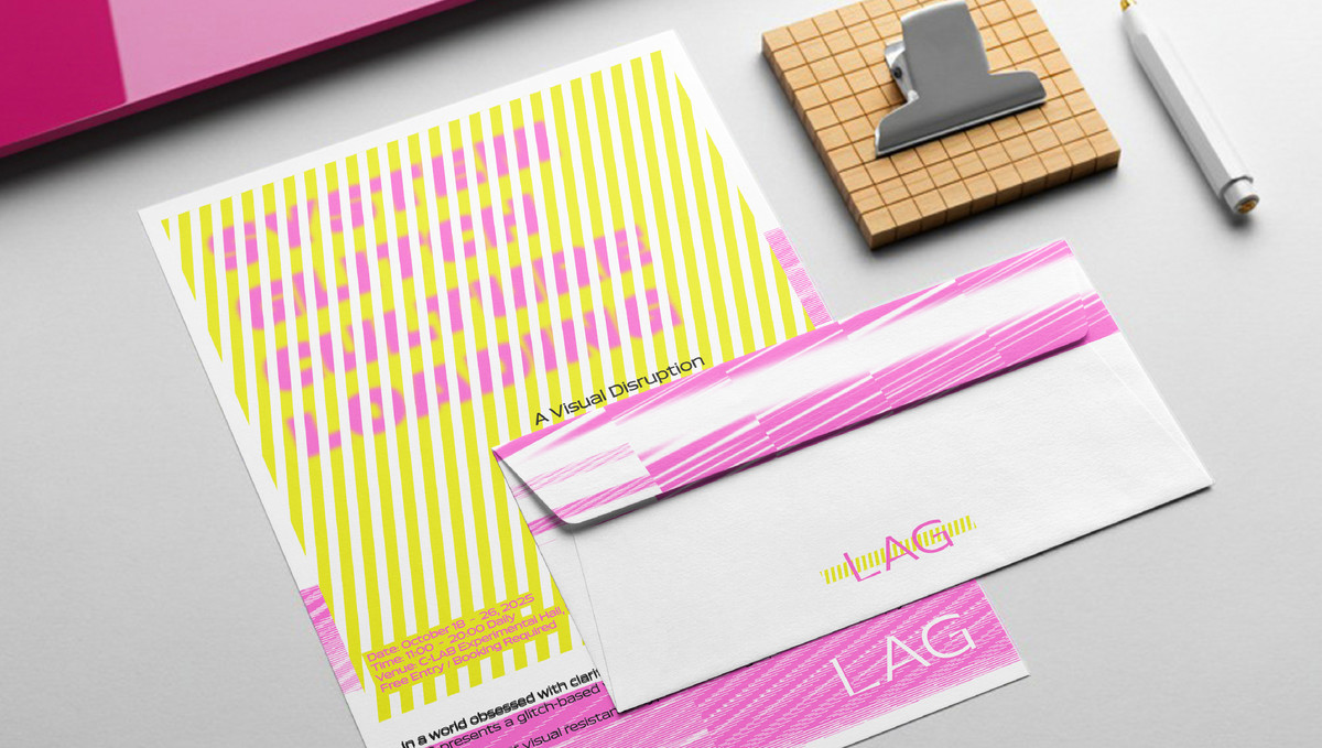
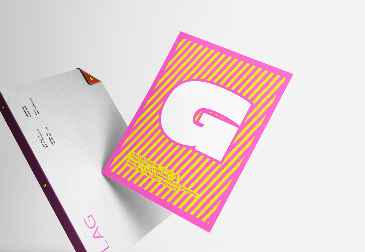
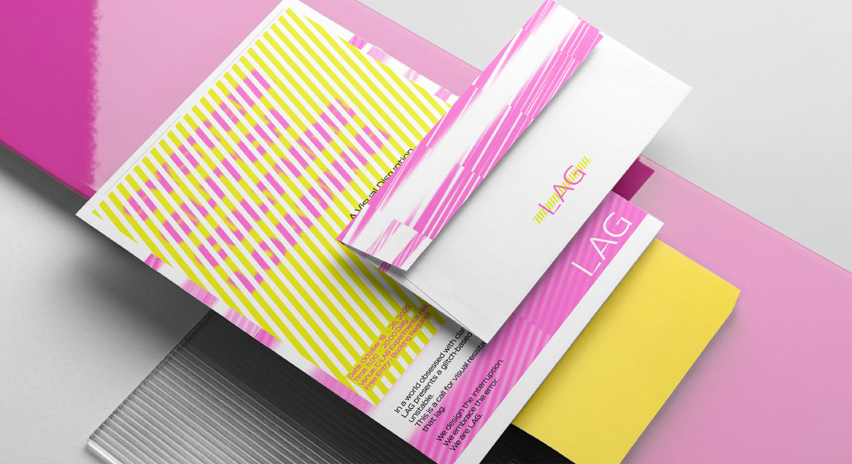
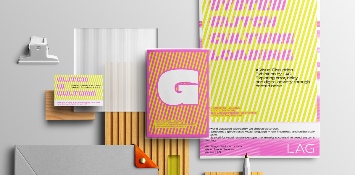
LAG 是一家创立于伦敦的实验型视觉品牌,其命名源自“延迟(Lag)”,象征当代数字社会中人与系统的错位与滞后。品牌主张将“视觉干扰”“错误美学”作为语言,而非故障,把失真、卡顿、噪点、偏移等现象重新定义为文化表达手段。

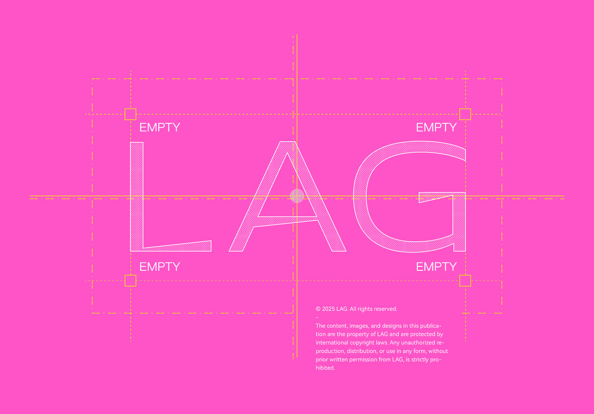
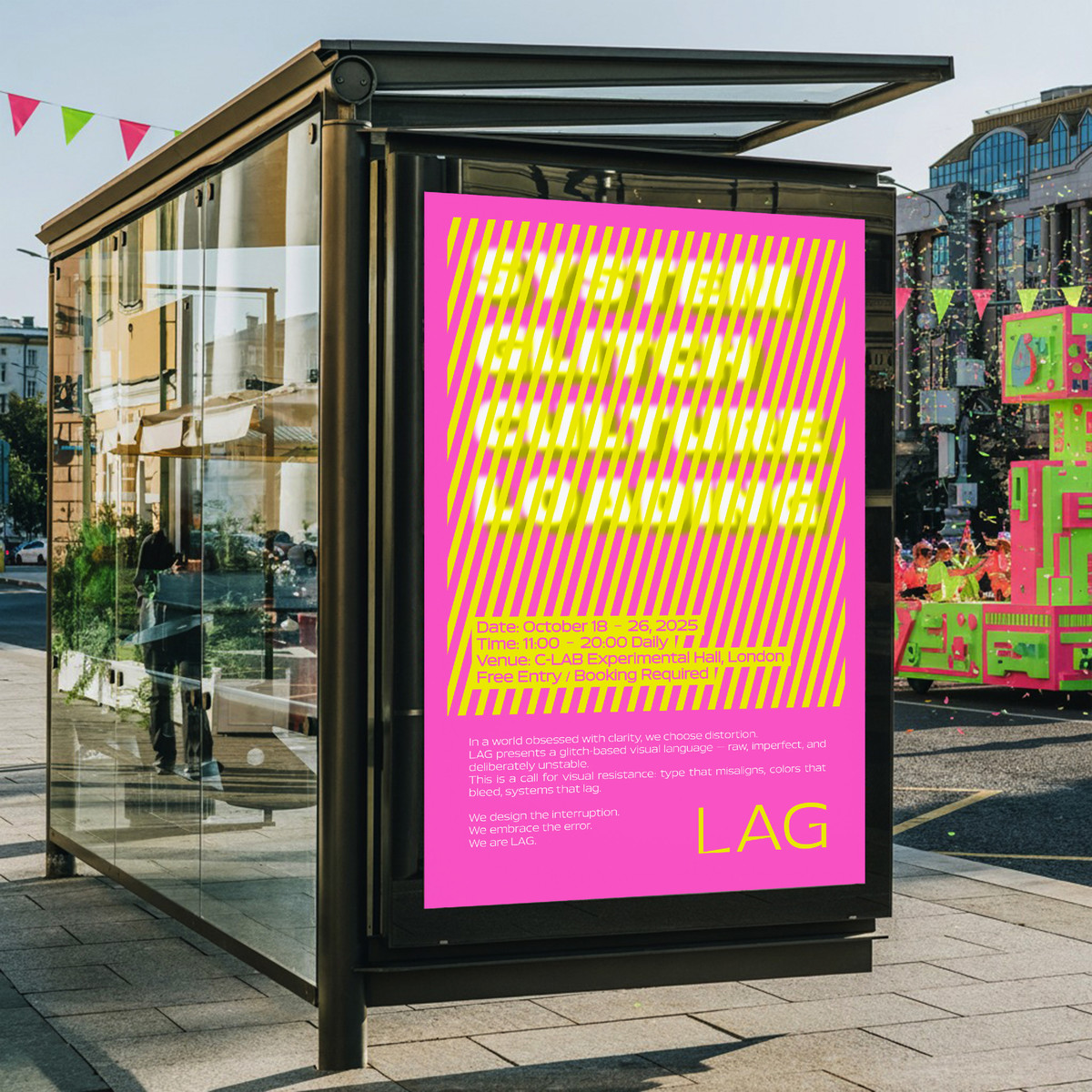
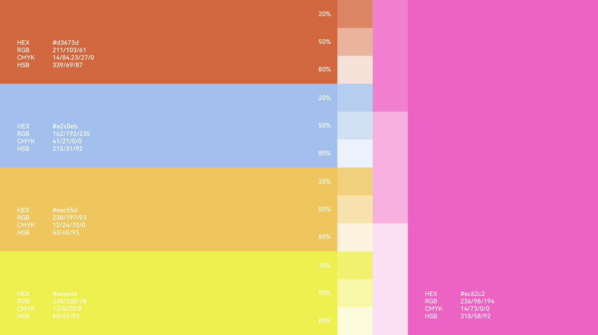
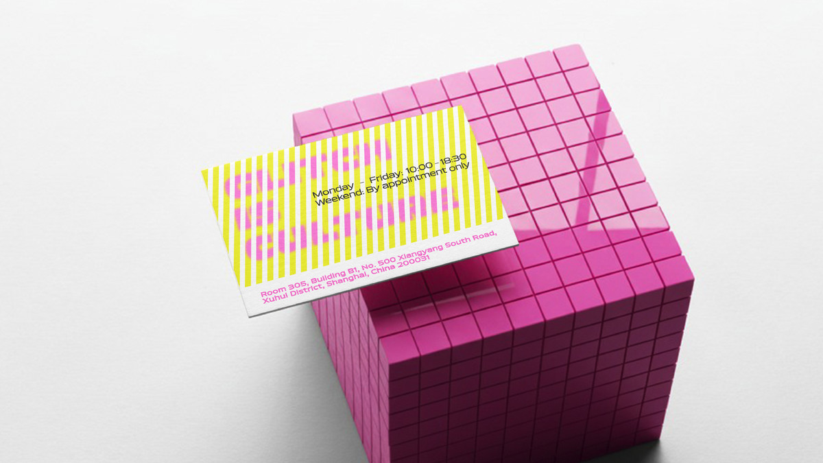
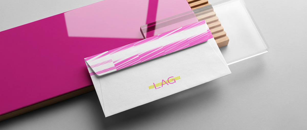
LAG 的标志采用错位、阴影与不对称结构构建,模拟系统加载失败或视觉残影的状态;色彩方面,大胆运用荧光黄、洋红、青绿与黑色,强调高饱和印刷与屏幕破损质感。版式风格拒绝传统网格与对齐,而选择扫描线、模糊遮罩、像素切片等干扰图层进行信息构建。

Section image
Section image
Section image
Section image
Section image
Section image
Section image
Section image
Section image
Section image
Section image
Section image
Section image
Section image
Section image
Section image
Section image
Section image
Section image
Section image
Section image
Section image
Section image