【我司案例】麒麟玉瓷|品牌logo设计
【我司案例】麒麟玉瓷|品牌logo设计
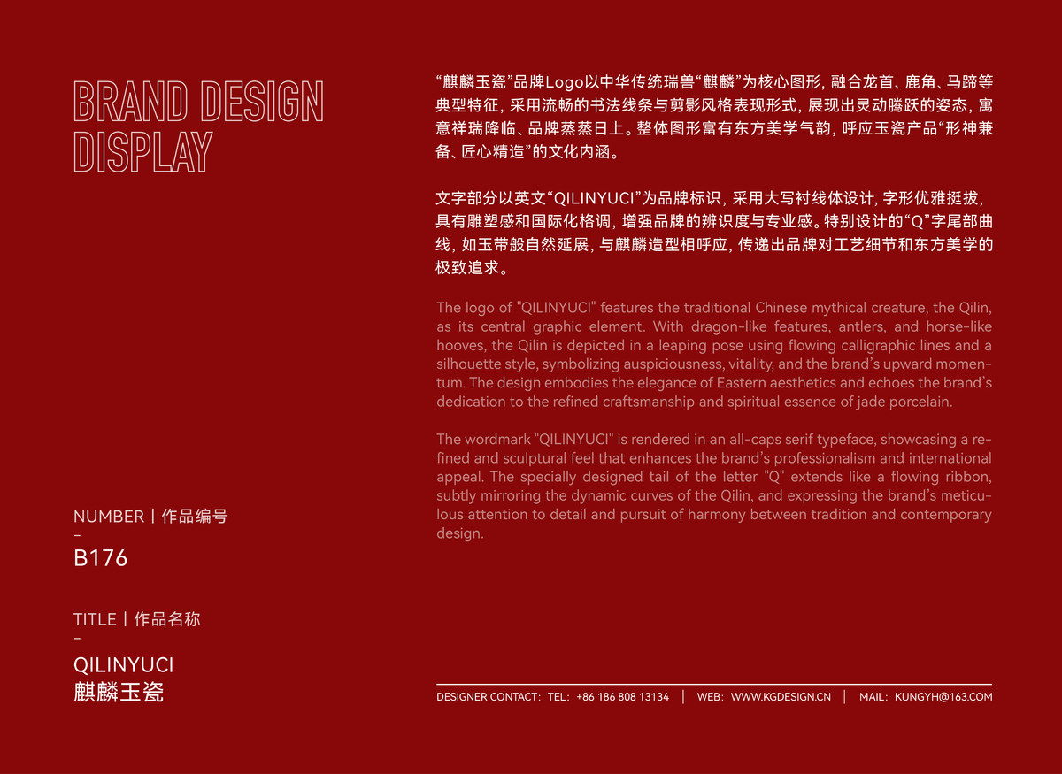
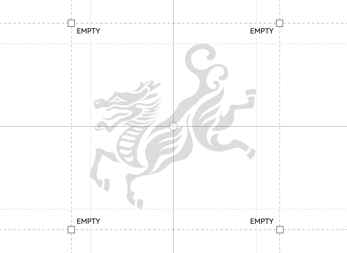
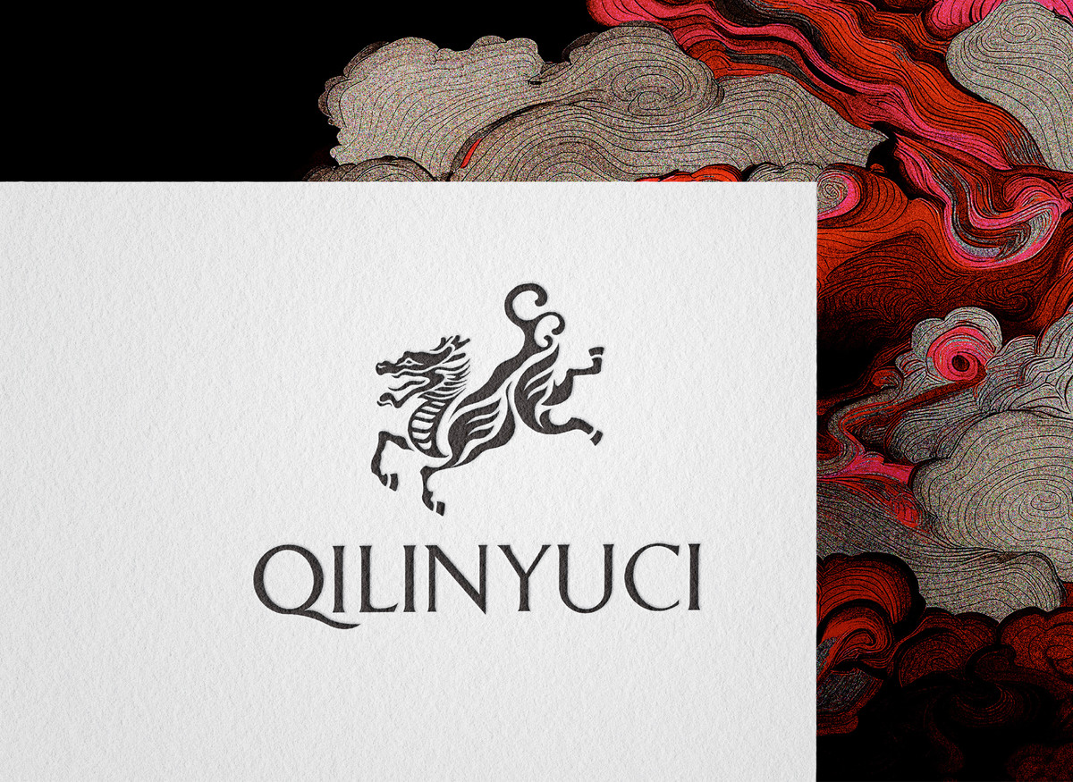
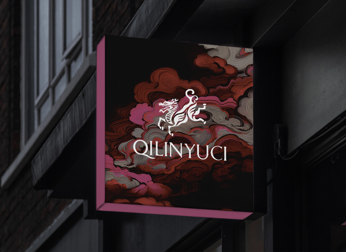
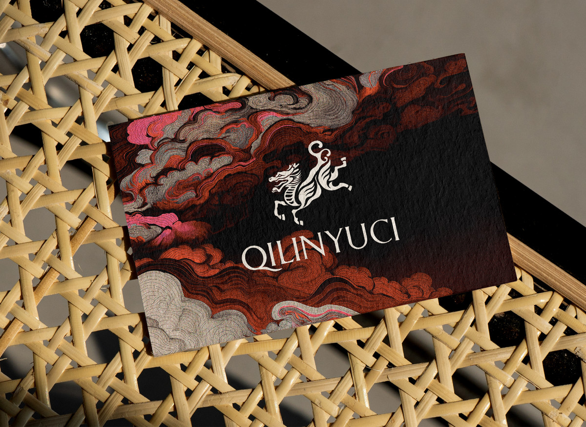
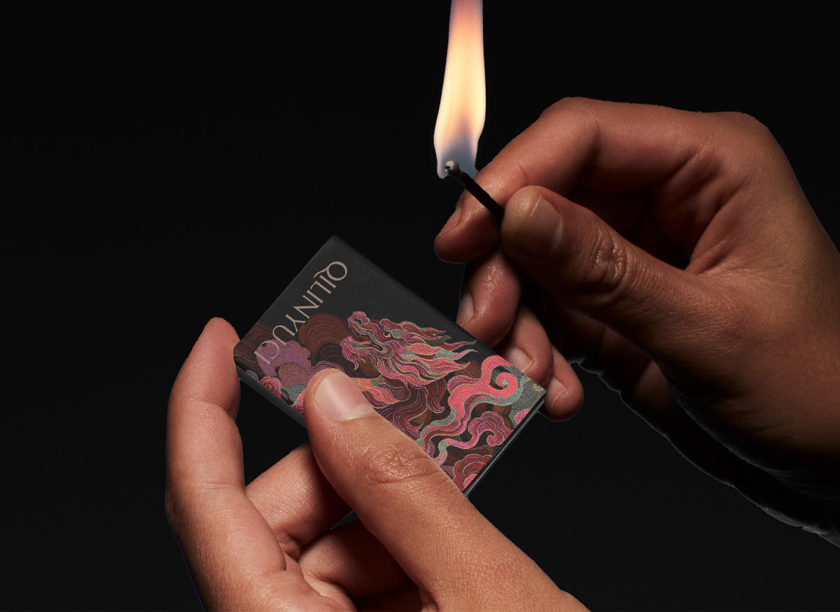
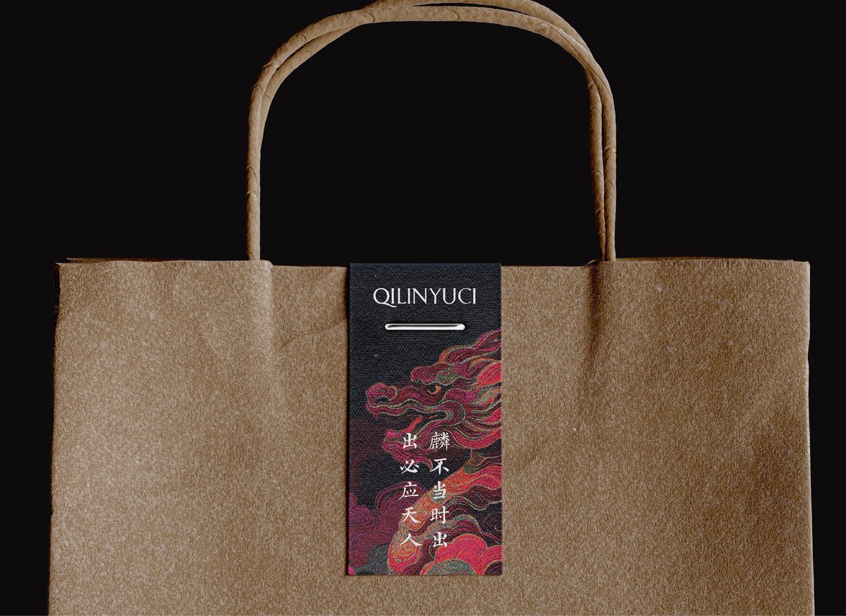
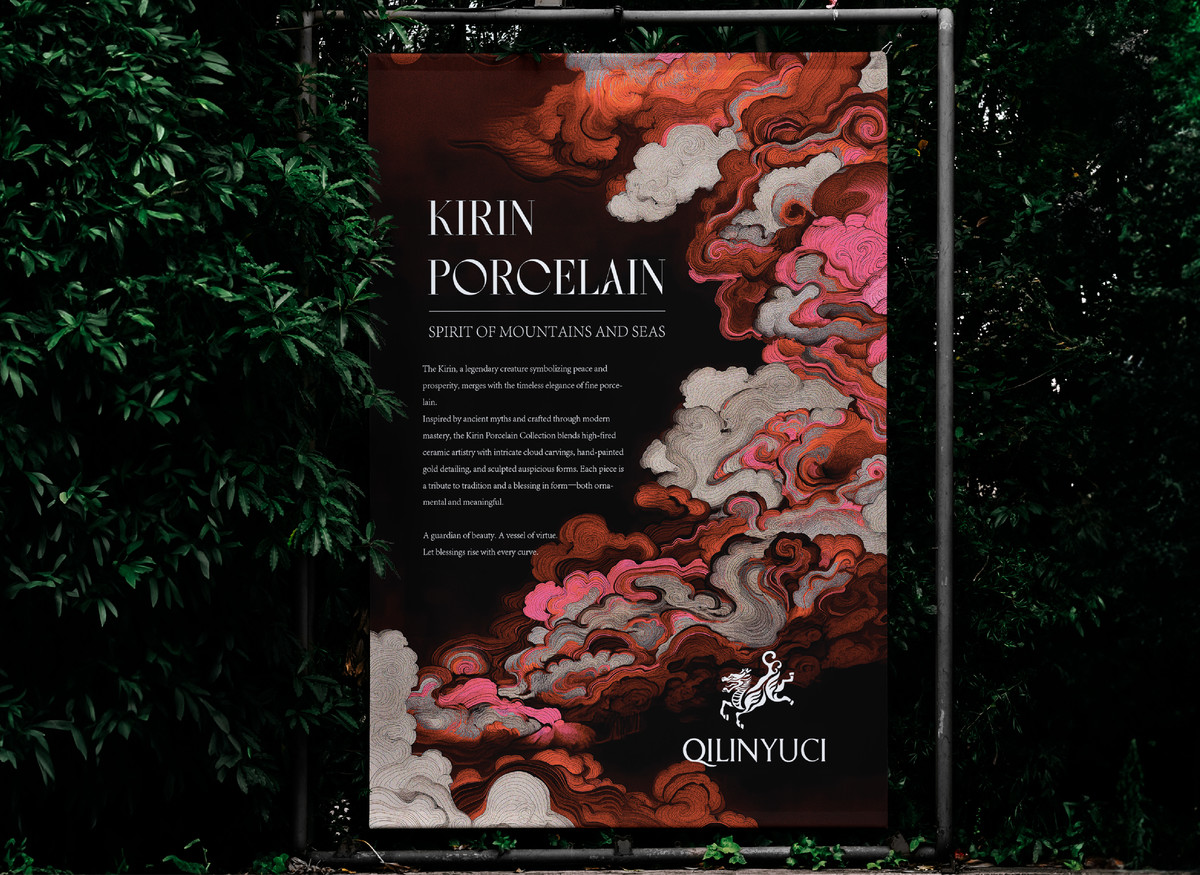
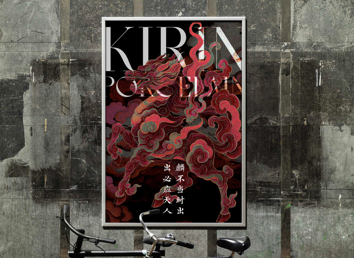
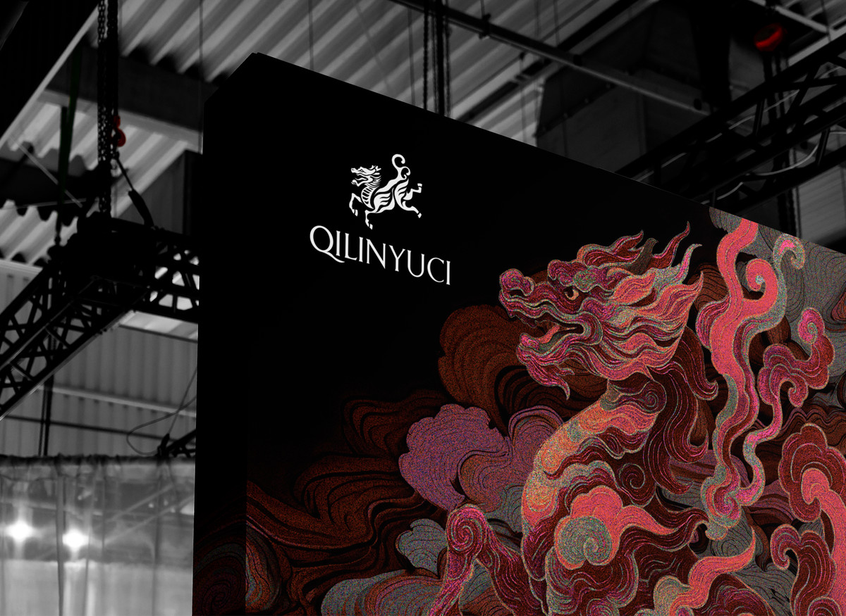
“麒麟玉瓷”品牌Logo以中华传统瑞兽“麒麟”为核心图形,融合龙首、鹿角、马蹄等典型特征,采用流畅的书法线条与剪影风格表现形式,展现出灵动腾跃的姿态,寓意祥瑞降临、品牌蒸蒸日上。整体图形富有东方美学气韵,呼应玉瓷产品“形神兼备、匠心精造”的文化内涵。
文字部分以英文“QILINYUCI”为品牌标识,采用大写衬线体设计,字形优雅挺拔,具有雕塑感和国际化格调,增强品牌的辨识度与专业感。特别设计的“Q”字尾部曲线,如玉带般自然延展,与麒麟造型相呼应,传递出品牌对工艺细节和东方美学的极致追求。
The logo of "QILINYUCI" features the traditional Chinese mythical creature, the Qilin, as its central graphic element. With dragon-like features, antlers, and horse-like hooves, the Qilin is depicted in a leaping pose using flowing calligraphic lines and a silhouette style, symbolizing auspiciousness, vitality, and the brand’s upward momentum. The design embodies the elegance of Eastern aesthetics and echoes the brand’s dedication to the refined craftsmanship and spiritual essence of jade porcelain.
The wordmark "QILINYUCI" is rendered in an all-caps serif typeface, showcasing a refined and sculptural feel that enhances the brand’s professionalism and international appeal. The specially designed tail of the letter "Q" extends like a flowing ribbon, subtly mirroring the dynamic curves of the Qilin, and expressing the brand’s meticulous attention to detail and pursuit of harmony between tradition and contemporary design.