【我司案例】BIG BRAINS|留学品牌logo设计
【我司案例】BIG BRAINS|留学品牌logo设计
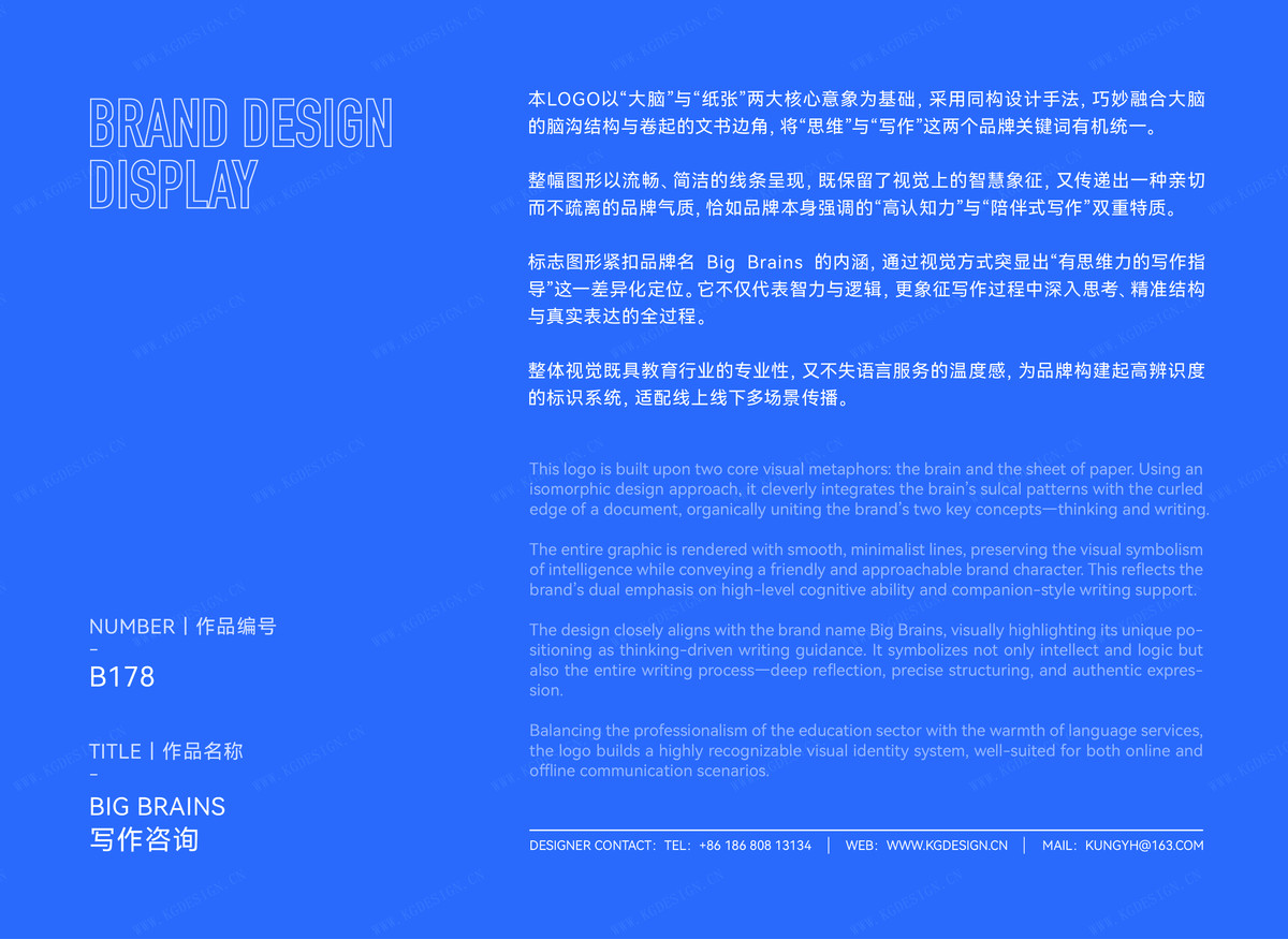
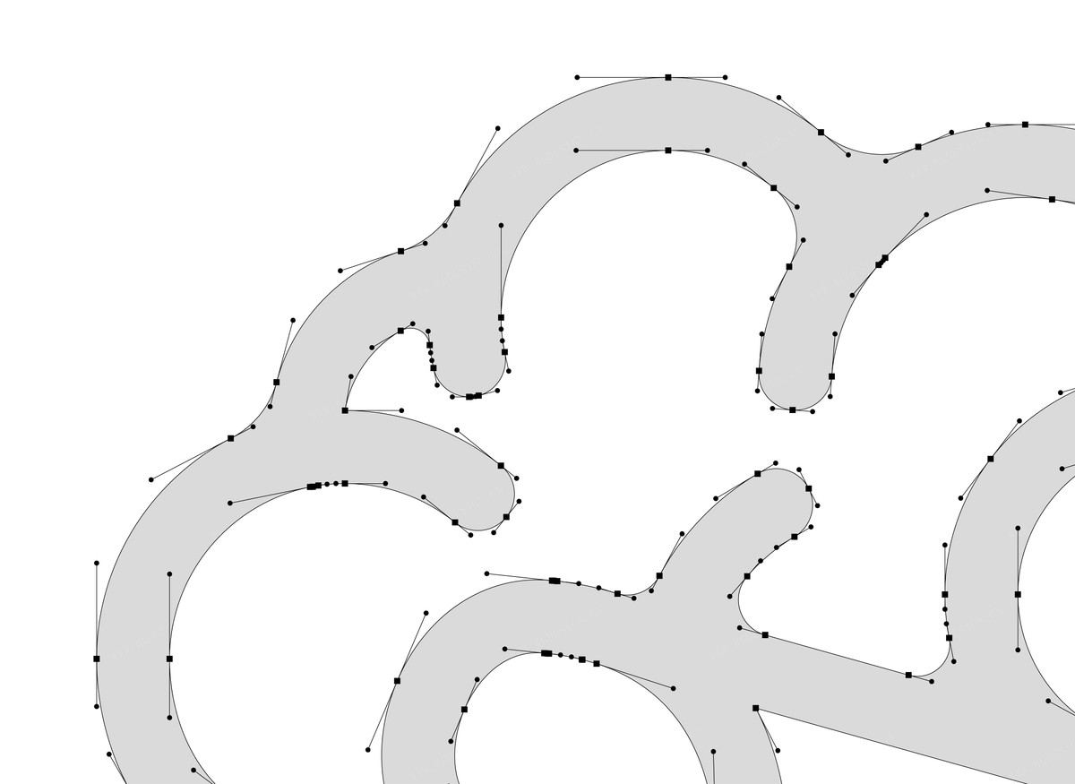
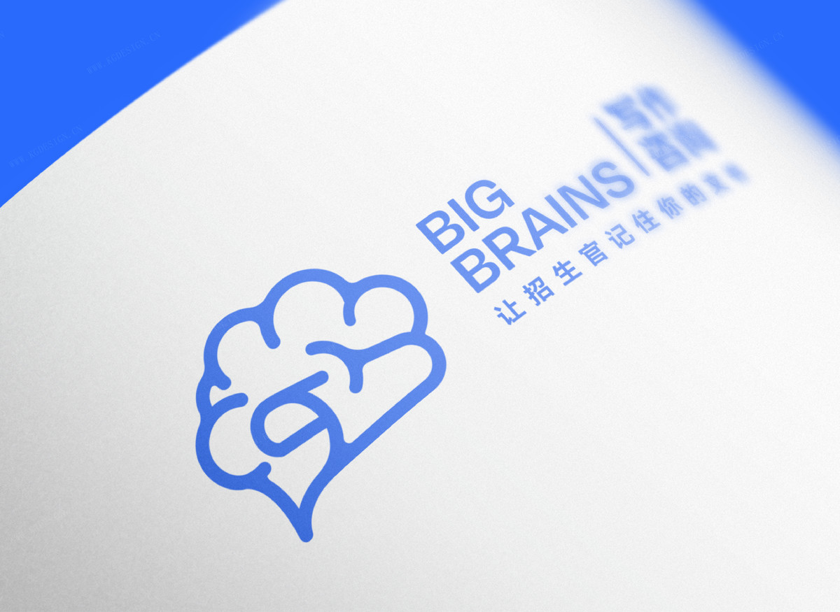
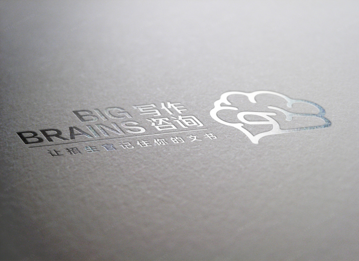
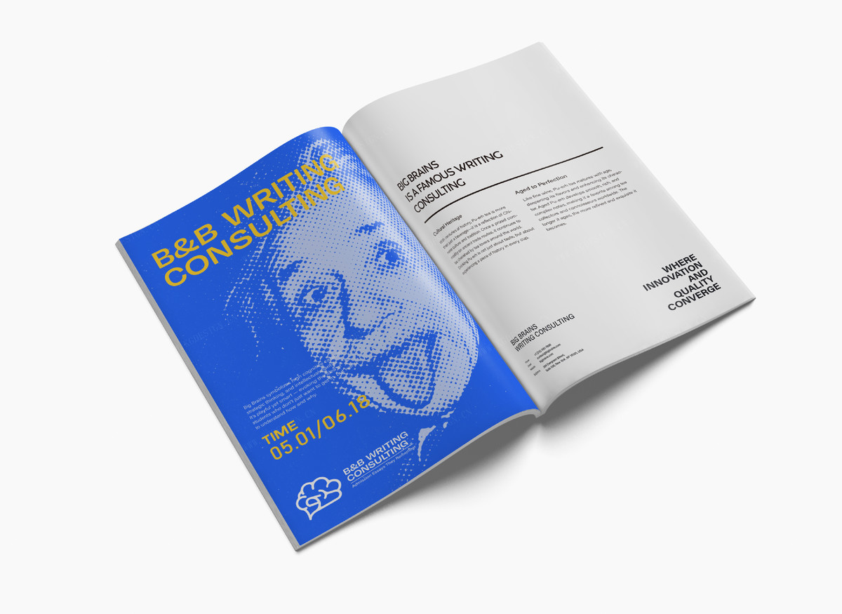
本LOGO以“大脑”与“纸张”两大核心意象为基础,采用同构设计手法,巧妙融合大脑的脑沟结构与卷起的文书边角,将“思维”与“写作”这两个品牌关键词有机统一。
整幅图形以流畅、简洁的线条呈现,既保留了视觉上的智慧象征,又传递出一种亲切而不疏离的品牌气质,恰如品牌本身强调的“高认知力”与“陪伴式写作”双重特质。
标志图形紧扣品牌名 Big Brains 的内涵,通过视觉方式突显出“有思维力的写作指导”这一差异化定位。它不仅代表智力与逻辑,更象征写作过程中深入思考、精准结构与真实表达的全过程。
整体视觉既具教育行业的专业性,又不失语言服务的温度感,为品牌构建起高辨识度的标识系统,适配线上线下多场景传播。
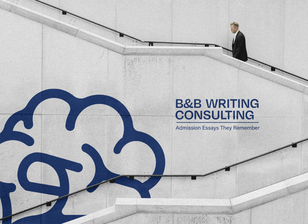
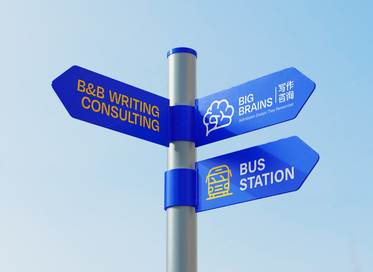
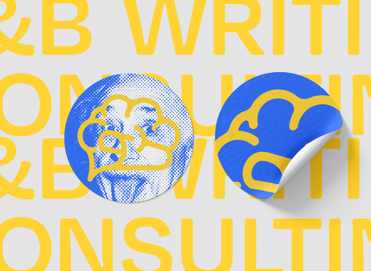
This logo is built upon two core visual metaphors: the brain and the sheet of paper. Using an isomorphic design approach, it cleverly integrates the brain’s sulcal patterns with the curled edge of a document, organically uniting the brand’s two key concepts—thinking and writing.
The entire graphic is rendered with smooth, minimalist lines, preserving the visual symbolism of intelligence while conveying a friendly and approachable brand character. This reflects the brand’s dual emphasis on high-level cognitive ability and companion-style writing support.
The design closely aligns with the brand name Big Brains, visually highlighting its unique positioning as thinking-driven writing guidance. It symbolizes not only intellect and logic but also the entire writing process—deep reflection, precise structuring, and authentic expression.
Balancing the professionalism of the education sector with the warmth of language services, the logo builds a highly recognizable visual identity system, well-suited for both online and offline communication scenarios.