【我司案例】东方碳足迹|环保品牌logo设计
【我司案例】东方碳足迹|环保品牌logo设计
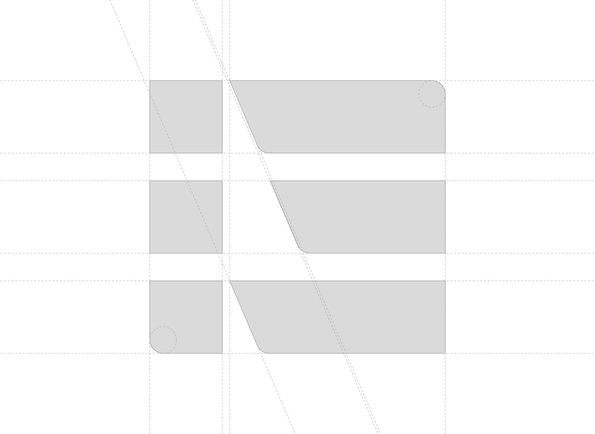
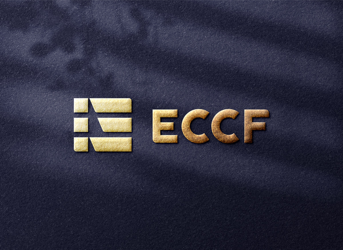
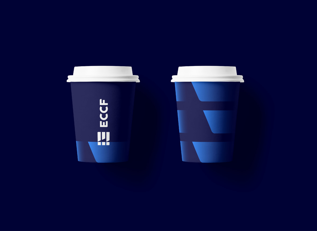
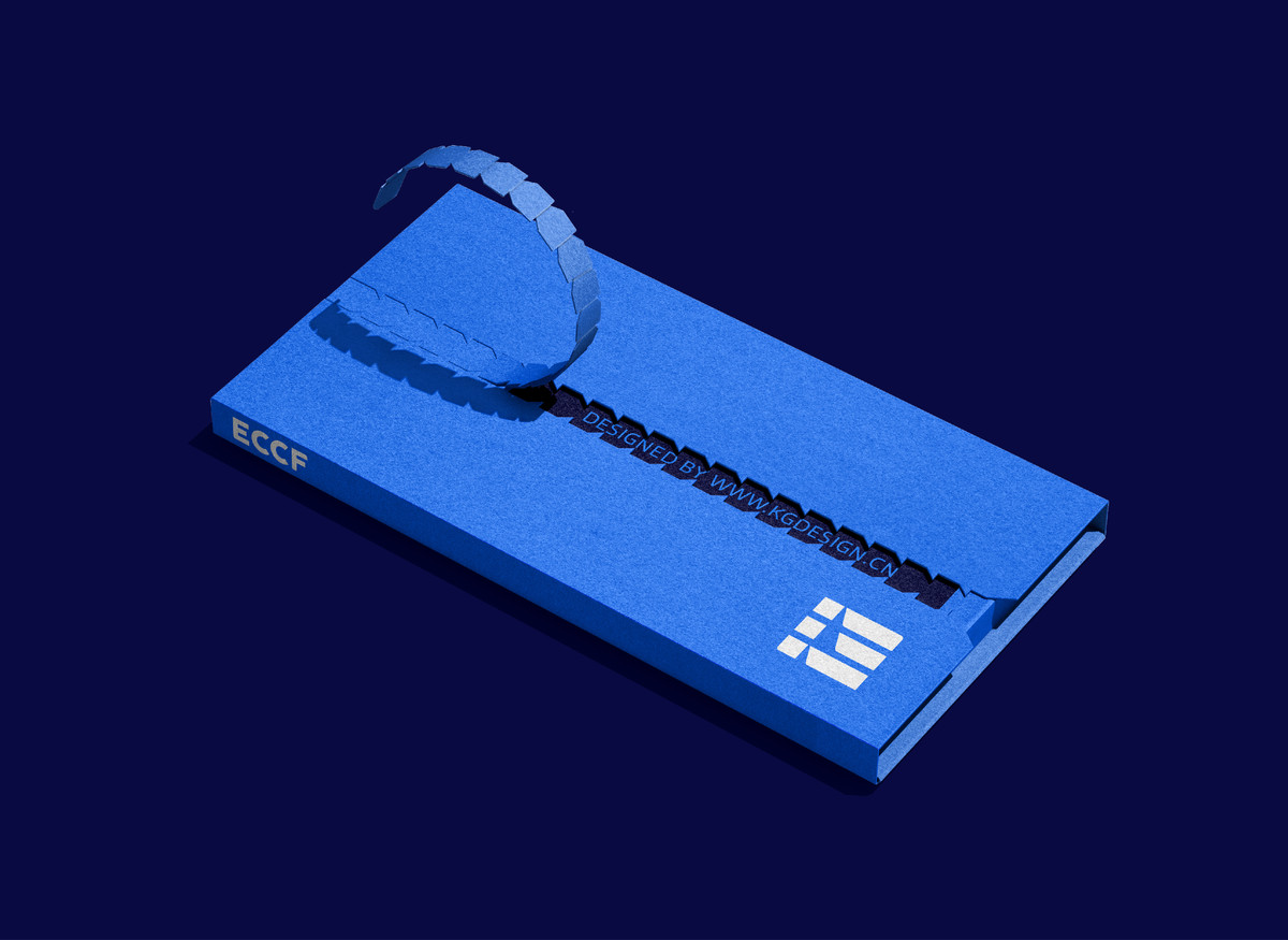
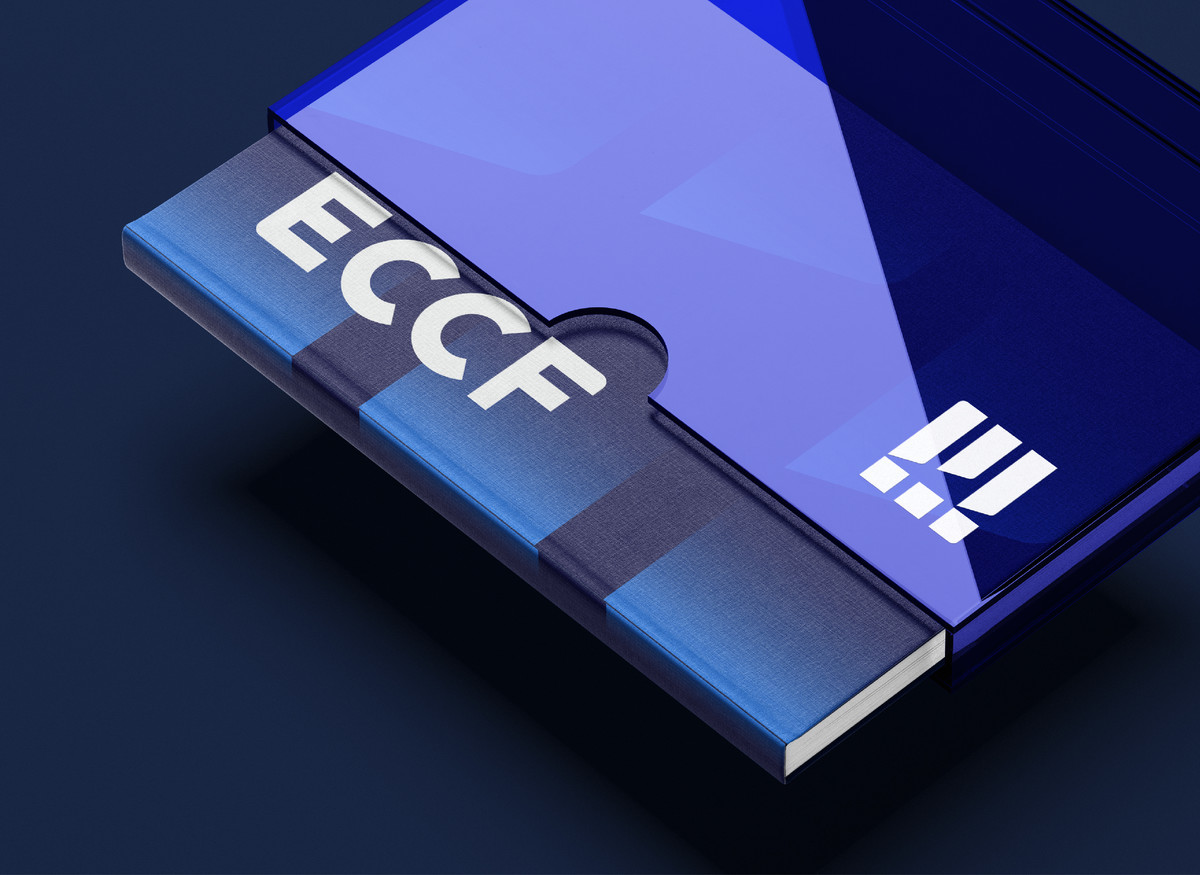
该LOGO在简约的结构下巧妙地融合了ECF三个字母的元素,呈现出清晰、现代、科技感的视觉效果。设计重点体现在形式与功能的统一,通过几何形态与线条简化的方式,传递了平台所代表的标准化、精准性和创新。 ECF字母的表现:通过字母的几何化处理,使用矩形与斜切线条相结合的方式,简洁而有力地展现了平台的核心信息。这种设计方法加强了视觉引导性,同时又与碳足迹的“减排”概念相契合。每个字母的形态变化既独立又相互关联,展现了平台的多维度服务与功能。 矩形框架与点线组合:矩形的使用强化了LOGO的系统性和结构感,代表了平台严格、标准化的管理流程。点线的结合则增添了科技感,传递出平台以科技为驱动力、依托数字化工具进行碳足迹核算与评估的核心理念。
This logo cleverly integrates the elements of the letters E, C, and F within a minimalist structure, presenting a clear, modern, and tech-oriented visual impression. The design emphasizes the unity of form and function, using simplified geometric shapes and lines to convey the platform's core values of standardization, precision, and innovation.
Representation of the ECF letters:
Through geometric treatment of the letters, the design combines rectangles with diagonal cuts to deliver the platform’s key messages in a clean and powerful manner. This approach enhances visual guidance while aligning with the concept of "emission reduction" in carbon footprint. Each letter maintains its own distinct form yet remains interconnected with the others, reflecting the platform’s multi-dimensional services and capabilities.
Rectangular framework and dot-line composition:
The use of rectangles reinforces the systematization and structural integrity of the logo, symbolizing the platform’s strict and standardized management processes. The integration of dots and lines adds a technological touch, representing the platform’s tech-driven approach and its reliance on digital tools for carbon footprint calculation and evaluation.